2016-2017 | Santiago, Chile
Re-Designing The Identity Of The Liberal Party
work on
Design system
Photography art direction
Print & Environmental
StrategY
Digital
The Liberal Party in Chile has an extensive and significant history. It was founded in 1849 and played a crucial role in shaping the next century with its progressive ideals and election of six presidents. Perhaps the most important contribution the party made to society was the promotion of the “laic laws” that shifted the power structure of this once conservative country, supporting a more humanist society. Then, the party was disbanded. But, in 2013, the party was restored by a group of young politicians under the age of 30. The renewed party embraced the humanist principals of the original founding fathers. In Spring 2016, I was in charge of re-designing the party’s new brand—upgrading the design(s) used for the 2013 relaunch.
The New Concept Illustrated A Young Progressive Party With A Prominent Past.
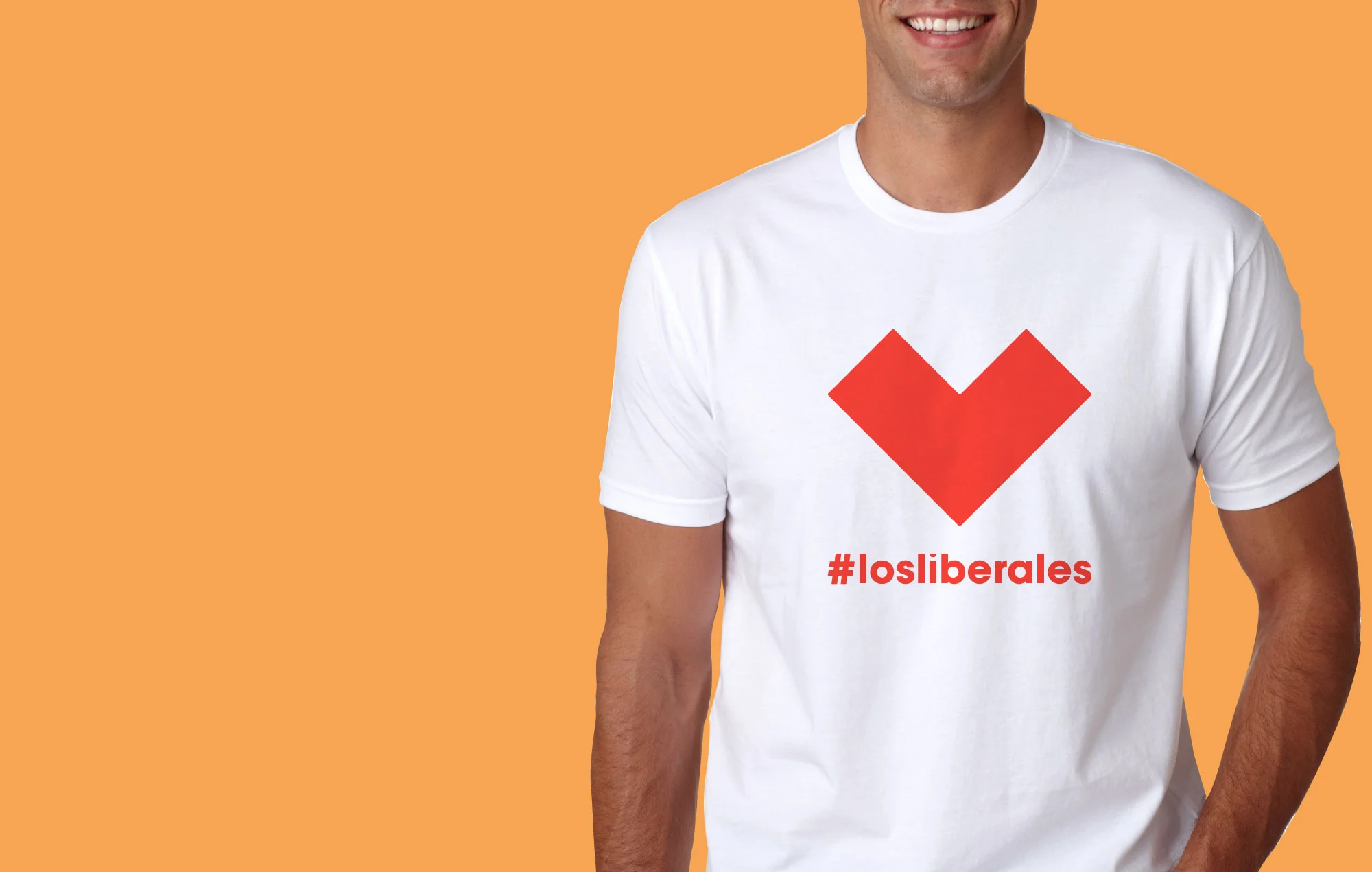
My idea was to create a contemporary-looking graphic system with endless permutations—a familiar mark that could also point to various ideas and issues—correlating to the variety of agendas of the Liberal Party.
BEFORE (2013)
AFTER (2017)
I built the wordmark using a geometric font with some modifications. I kept the red box used in the original version, but changed the saturation of red and eliminated the blue stripe at the bottom. I wanted to create a logo that was both monochrome and versatile.
The pictoral mark is an “L” taken from “Liberal.” It was built using three squares. Like the logo, it was designed to be versatile and always changing in an effort to communicate the different messages of the Liberal Party. It can rotate, include images, or even frame slogans. I wanted a dynamic design that represented the party’s fresh and sharp point-of-view. The final design is something that can be adapted to reflect culture, yet used to project a professional tone for the Liberal Party.


